Responsiveness
Essentials
The most common thing you look for is:
1.Not having the images blast out in Outlook.
2.On smaller screens you want images to appear smaller so there is no scrolling involved.
3.And on screens with high resolutions you want images to appear normal sized, that is not miniature, or fuzzy. For this you want images with slightly bigger sizes than normal, resized in the view port. And that will make Outlook explode, because it ignores all the fancy @media query stuff that makes up the responsive techniques, and just show the image in full size. (More on media query below)
So the thought seems to be, to design for new hand held device first, and then hack the resulting html to also work in Outlook.
When it comes to email, best HTML/CSS practices for the web do not translate well at all to email. There are dozens of mail clients and webmail providers out there, and none of them are standardized and/or support any of the latest and greatest CSS and HTML standards. Each one of them supports HTML and CSS to differing degrees, some strip out @media tags, and some even strip out linked CSS files. Some don't even read HTML/CSS at all, so you have to include a plain text version of your email along with your HTML version.
Whereas CSS support in email clients is very incoherent, html attributes on the other hand is very reliable. E.g. attributes like align=”left” and cellpadding=”12″ are much more reliable than their CSS equivalents; "float: left"; and "padding: 10px;".
So one of the golden rules of email design is "where possible, use HTML attributes instead of CSS".
Conditions
A common method for hacking the design to work in Outlook, is to use conditions.
This way you can override the design. Here is few simple conditions to illustrate.
<!--[if gte mso 9]>
<style type="text/css">
/* This will be included. Your Outlook-specific CSS goes here. */
</style>
// Or it could any html like table begin.
<![endif]-->
<!--[!if gte mso 15]><!-->
// This will be ignored by Outlook 2013
<![endif]-->
<!--[if !mso]><!-->
// This will be ignored by all Microsoft Outlook
<!--<![endif]-->
gte: greater than or equal to
lte: less than or equal
<!--[if mso | ie]> :
"when Outlook or IE"
But a condition that is "All other" is a tricky thing.
<!--[if mso]>
According to the conditional comment this is Office<br />
<![endif]-->
<!-- [if !IE]> -->
According to the conditional comment this is not IE 5-9<br />
<!-- <![endif]-->
Note the difference.
It is very clever!
Conditions are ONLY supported by IE and Office.
So if Firefox does not read conditions, how can we make a condition [if !IE] that is NOT IE??
If it is not IE then it must be e.g. Firefox, but if that does not process conditions, then how is it going to give us the content of the inner logic?
<!-- [if !IE]> --> also means ALL OTHERS, or IE must ignore this because it is for all others.
This is key.
So the commenting syntax is made so it is actually not a comment, and only IE regards it as such, and then remove it.
So in both case IE does the processing, whereas all other ignores the comments.
<!-- [if !mso]> -->
This does not work in Outlook however.
<!-- <![endif]-->
The beginning line must be
<!--[if !mso]><!-- -->
You have the option to build it for Outlook, and make conditional variations for all others, or visa versa.
It’s the same thing you’d use to target Internet Explorer 7 when building a website, except it targets Microsoft Office, or ‘mso’.
In the example above, ‘gte’ is added to have the comment apply only to versions of Microsoft Office greater than or equal to X.
You can also target lesser, or older, versions by using ‘lt’. Using ‘gt’ and ‘lte’ will target versions greater than, or less than or equal to, respectively.
Outlook Version Numbers
Using Microsoft Office version numbers allows you to target specific Outlook clients. In the example above, ‘mso 9’ is Office 2000, which means you’re targeting Outlook 2000. Other version numbers allow you to target other clients, meaning you can build stylesheets tailored to each version of Outlook.
Outlook 2000 - Version 9
Outlook 2002 - Version 10
Outlook 2003 - Version 11
Outlook 2007 - Version 12
Outlook 2010 - Version 14
Outlook 2013 - Version 15
Outlook 2016 - Version 16
Because Outlook 2003 - 2003 was driven by the IE6 rendering engine, those client versions are relatively stable. From Outlook 2007 and on, the rendering engine was changed to Word, making Outlook incredibly problematic for email. You can leverage this conditional CSS to squash bugs and greatly reduce your email development-related headaches.
Hi-Res images
Don't start serving hi-res images to retina screens in emails. It is tempting but remember all your emails are stored in a database, and this will fill up in just a few months’ time. You should always keep your images optimized to under 50Kb, unless it is only for a short time, like in a campaign.
Media Query Support
What is media query?
It is the new technique for making the same content show differently on various platforms. It has hardly been invented and is now soon obsolete, in favour of fluid.
Here is an example:
<!-- CSS media query within a stylesheet -->
<style>
@media (max-width: 600px) {
.facet_sidebar {
display: none;
}
}
</style>
In this style sheet, only clients with a view port smaller than 600px will apply this style. The rest will ignore it.
Supported platforms
But please note whereas Outlook App may be on the list, it does not mean that it also support all CSS techniques. (The style inside the query filter)
|
iOS (iPhone/iPad) |
Yes |
|
Android 4.x native client |
Yes |
|
Android Outlook Exchange via native client |
No |
|
Android Outlook.com app |
Yes |
|
Android Gmail app |
No |
|
Android Yahoo! Mail app |
No |
|
Gmail (Android Browser) |
No |
|
Outlook.com (Android Browser) |
No |
|
Yahoo! Mail (Android Browser) |
No |
|
Windows Phone 7 |
No |
|
Windows Phone 7.5 |
Yes |
|
Windows Phone 8 |
No |
|
BlackBerry OS 6 |
Yes |
|
BlackBerry OS 7 |
Yes |
|
BlackBerry Z10 |
Yes |
|
Kindle Fire native client |
Yes |
Example
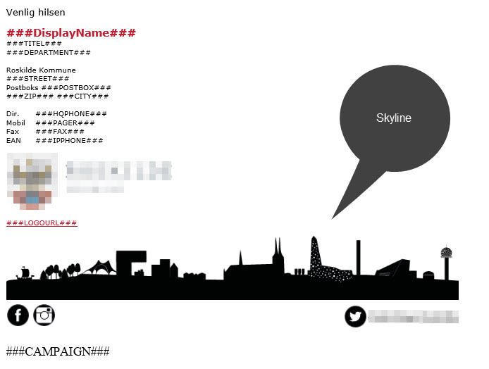
At the bottom of the signature we want to add a wide image (Skyline) along with 3 social media icon links. That turns out to be very complex.
Lets look at the code for this.
We basically want it to fill the screen from left to right, on all devices.
But if the screen is wide we want it to have an upper limit of 600px wide to it is not getting out of proportions with the rest.
You should think you can just add an image and set it to 100% wide. But when you want to make it work across all platforms including Outlook you end up with this.
<!-- Begin Skyline Block -->
<!-- Responsiveness in browsers are supported by the Media Query method. But is a strictly a CSS method. Outlook is not good at media queries to put it mildly. So we use conditions instead. In MS-Outlook Max-width does not work, so we have to wrap it all in a limiting table -->
<!--[if gte mso 9]>
<table width="600" style="table-layout: fixed; width:600px"><tr><td>
<![endif]-->
<!-- If you specify table-layout: fixed; the image size will follow the table size when resizing windows. There seems to be some contradictory terminology in the standard regarding table layouts. In particular, table-layout: auto; documentation says: [The column width is set by the widest unbreakable content in the cells] Since image content is unbreakable, it sets the width of the cell to the size of the content. So responsive images inside tables MUST have "fixed" as layout style.
-->
<table cellpadding="0" cellspacing="0" width="95%" style="table-layout: fixed;">
<tr><td width="100%">
<img src="Skyline.png" alt="skyline" style="max-height:85px; max-width:600px; border: 0;
vertical-align: middle; width: 100%; height: auto;">
</td></tr>
<tr><td width="100%">
<!-- Inner table for media icons -->
<!-- Max width on tables conflict with plain width. So DIV must be used -->
<div style="max-width:600px">
<table style="width:100%; margin-top:5px;" cellpadding="0" cellspacing="0" height="30">
<tr><td align="left" height="30">
<a href="https://www.facebook.com/xyz/"><img src="fb.png" alt="Fb" border="0"></a>
<a href="https://www.instagram.com/xyz"><img src="Insta.png" alt="Insta" width="30" height="30" border="0"></a></td>
<td align="right" height="30">
<a href="https://twitter.com/xyz" style="text-decoration:none">
<img src="twi.png" alt="Twit" width="30" height="30" border="0"> </a></td>
<!-- Outlook totally ignores valign:middle, so we have to add it to a separate cell to make it center -->
<td align="right" width="10" nowrap><a href="https://twitter.com/xyz" style="text-decoration:none; font-style:normal">
<span style="FONT-FAMILY: verdana, arial, helvetica, sans-serif; FONT-SIZE: 9pt; color:#000; padding-top:10px; padding-bottom:10px; text-align:center; height:30px">#XYZ</span></a>
</td></tr>
</table>
</div>
<!-- End inner table for media icons -->
</td></tr>
</table>